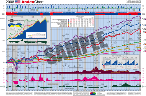
Interesting Data Graphic: The Andex Chart

The Andex Chart (US version, Canadian version) is a graphic that combines a ton of data from various sources for the past century: presidential terms, market indexes, world events (“IBM PC introduced in 1981”), interest rates, price of oil, inflation, etc. It’s intensely interesting.


2 Comments:
Where can I find a Canadian version of the 2009 Andex chart?
By Anonymous, at 5/09/2010 11:07 a.m.
@Anonymous - Looks like the 2010 Canadian Andex chart is here: http://corporate.morningstar.com/ca/documents/SampleContent/ADV_ANX_SampleContent.pdf
By Jonathan, at 7/21/2011 8:35 p.m.
Post a Comment
<< Home