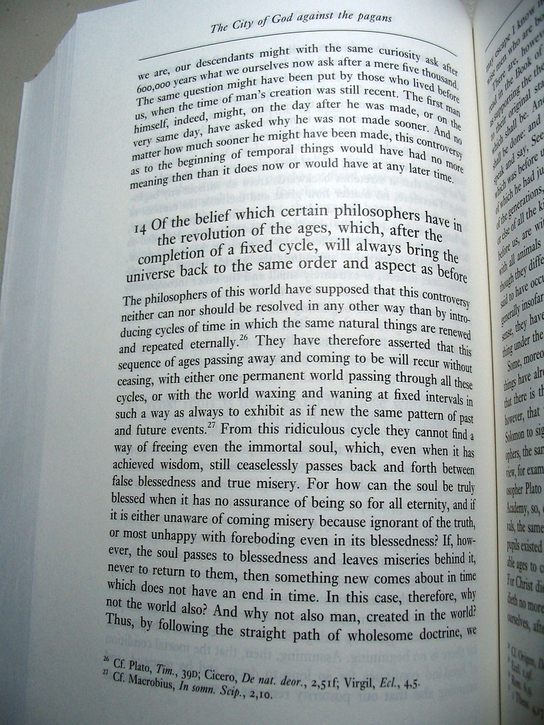
Two examples of good book design
There's something about the design of this book that says "authoritative", "scholarly". The font is pleasing to the eye; it's not Times New Roman – anyone know what it is? There's something about the layout, the font, the stylistic restraint that lets you know that you are looking at a definitive, significant work.
Augustine. "The City of God against the pagans". Translated by R. W. Dyson. Cambridge University Press, 2007.
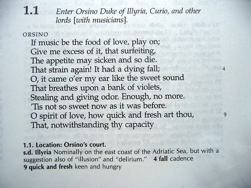
Here's another example of good book design: the Works of Shakespeare, edited by David Bevington:
One smart thing here is that line numbers are given only for lines with footnotes.
Another nice thing is that names are given in full ("Orsino") – never abbreviated.
Has a book ever struck you as exhibiting particularly good design? Post some pics!


6 Comments:
This is the kind of feeling contrast we have when comparing regular articles and academic papers written in LaTeX. The spacing+fonts+everything just looks beautiful and serious.
You probably already know or use this tool for code documentation, but just in case you don't, take a look at http://code.google.com/p/code-illuminated/ Very nice concept :)
By Fabricio, at 3/29/2009 10:24 a.m.
Nice tool - thanks Fabricio!
By Jonathan, at 3/29/2009 1:11 p.m.
Only the obvious - Tufte's books are very, very nicely done.
By Thomas David Baker, at 3/29/2009 4:07 p.m.
Ah yes, love Tufte's books.
By Jonathan, at 3/29/2009 6:34 p.m.
I've long been a fan of Donald Knuth. Visually appealing technical books are almost impossible to find, and yet Knuth always comes through. I would inline the pic, but I'm not allowed to use <img> tags for some reason. Maybe this will work.
By あじ, at 4/03/2009 8:39 p.m.
Great pic, Aji!
By Jonathan, at 4/03/2009 9:24 p.m.
Post a Comment
<< Home